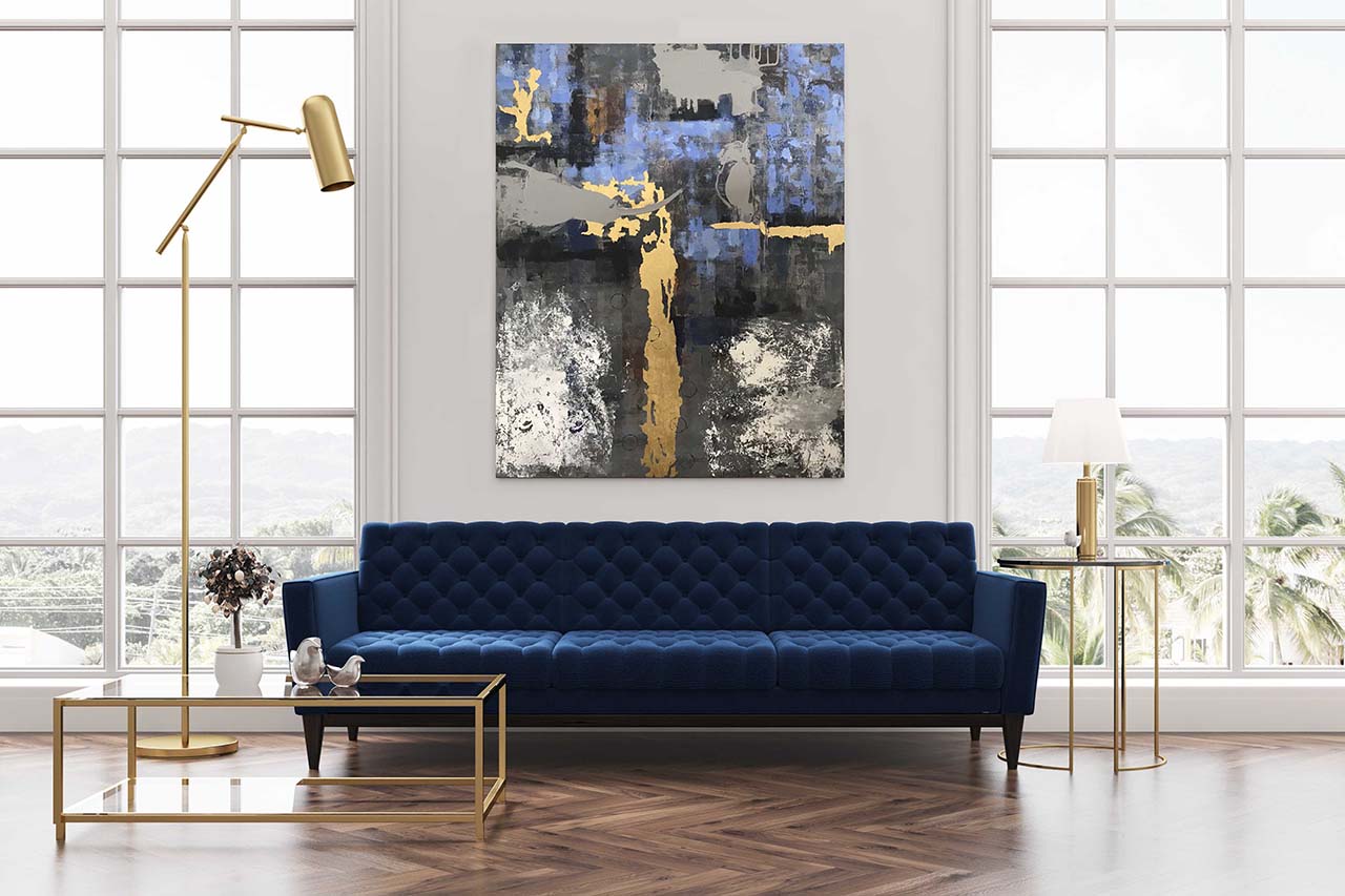
Painting in scene above, Indigo Lake, 48″ x 60″, acrylic and gold on canvas
Last year at this time Bruce and I moved into our newly built home in Fort Myers, Florida in a community called Wild Blue, on Indigo Lake. Perhaps I was inspired by the poetic name, or images of electric blue skies and shimmering white light on the surface of the lake, but I decided to decorate the main living area of our new home primarily with bright white and deep navy blue, with touches of grey, metallics, and natural materials such as wood and shell, in clean contemporary lines.
Abstract vs. Representational
A large wall in the living room begged for a large-scale piece of art. I decided to paint something myself. I mocked up several ideas for pieces I might paint.
While I did like the ideas, the representational forms in the scenes didn’t meld with my overall vision for the room. An article I read about decorating with abstract art clarified what I was feeling, “The open-ended [abstract] subject matter won’t dominate a room’s narrative, while the eye-catching composition—whether geometric, fluid, or painterly—will help create movement and depth in the space.” So, that settled it, the painting would be an abstract.
In creating a mockup, I considered the scale of the room and determined that the painting should be 60” tall. I wanted to use a standard aspect ratio, so I made it 48” wide. Given the large size I decided to paint on stretched canvas, which is much lighter than an aluminum panel of that size. The mocked-up painting in the photo shown above depicts a painting of that size. The size felt right to me.
Study
I gathered inspiration for the abstract I would paint, including photos I’d taken of sunrises over our lake and scenes in the community. I drew colors cues from the décor in the room, especially the area rug in the center. I planned my approach, thinking back to techniques I’d used in the past, looking for things that would express the mood I was going for.
I’ve always been fascinated with the timeless nature of weathered painted surfaces, like those you see in historic locales, such as New Orleans. I decided to use a combination of a palette knife and a brayer, a roller used in print making, using darker low-key hues that recede into the background.
Our house faces east so we see breathtaking sunrises from our patio each morning. Often the sun creates a dazzling golden streak running vertically across the water or horizontally along the tree line. I decided to use gold leaf to represent the brilliant sunshine. I pressed crumpled paper dipped in white paint into the surface to loosely represent white caps and the foam that collects at the shore. Together this would create visual excitement and a layer that moves into the foreground.
In order to see if these ideas hung together visually, I created a small study before attempting the full-sized piece. I thought you might want to see how this was done, so I filmed the creation of the study. The link to the video is at the end of this email.
Full-Sized Painting
After completing the study and deciding that I did like it, I set out to paint the full-sized piece. I enjoyed the full-body experience of working big and bold and I’m happy with how it looks, and feels, in the room. It was good as an artist, also, to branch out a bit and try something new.
The Creation of the Study
Click the image below to watch the creation of the study for “Indigo Lake.” I suggest listening with headphones so you can hear the music track, “Wash,” by Timothy Infinite.